Turning Greeting Card Sketches Into Motion Experiments
Every once in a while, after sketching and finishing a new greeting card, I get curious about how the design would look if it suddenly… moved. I’m not a motion designer (at all), but Smart Animate in Figma makes it easy to turn a few card iterations into a quick, silly animation.
These little experiments aren’t polished or precious, they’re just a fun way to replay the design decisions behind the cards. Here are a few favorites, plus the finished cards they came from.
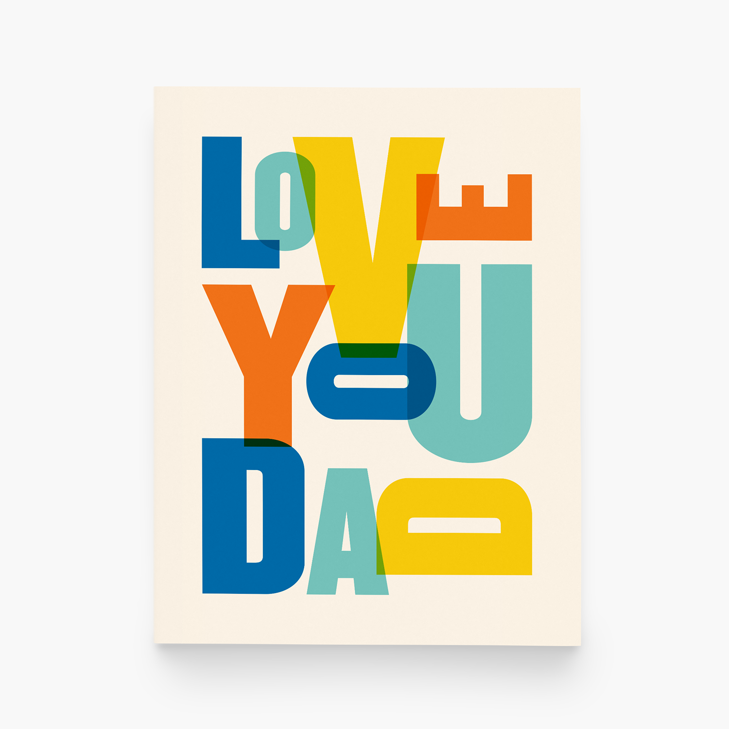
The birthday design that got me hooked
First up: the birthday design that started it all and pulled me into this whole motion-experiment rabbit hole. Here’s a (very loose) “storyboard” showing a few of the early sketches and how I played with layout, spacing, and the switch between solid colors and outlines.
How I animated this in Figma
Start with several frames already designed: I saved out four different versions of the birthday card, each showing a slightly different direction. Instead of rebuilding from scratch each time, I duplicated the previous frame (keyboard shortcut: option + drag), which kept all the elements aligned across versions.
Make small changes from frame to frame: Because everything stays linked, any change — switching strokes to fills, adjusting how the type expands or contracts, or shifting the layout — animates cleanly between frames.
Set up the animation in Prototype mode: I switched over to the Prototype tab, created a new flow, and connected Frame 1 → Frame 2 using Smart Animate. Then I repeated the same connections: Frame 2 → Frame 3 → Frame 4 → back to Frame 1 (so it loops).
My settings for this animation:
Trigger: After delay (200ms)
Animation: Smart Animate
Cycle: Ease out
Duration: 300ms
Preview the animation: Click the little play icon to view the prototype animation. Because each element is consistent across frames, the transitions look smooth as the shapes grow, move, and swap between outline + fill seamlessly.


Mixing in more color and compositions
This was the point where I realized how addictive Smart Animate is. The fun of this one is in the mix of tiny changes and big swings. It starts with simple color swaps, and then suddenly the whole composition shifts in scale and layout. There’s a lot happening, and it’s the kind of animation you end up watching a few (too many) times just to catch everything.

Adding in some “bounce”
This is another experiment where I mixed layout and color changes, but what really makes this one fun is the “bouncy” animation style instead of a smooth ease. It gives the whole thing a little spring in its step — the kind of motion that makes the letters feel extra celebratory. It’s simple, but the bounce adds a lot of personality.


The thing that really makes this part work is the iteration.
We all make tiny changes as we refine a design, but for these experiments, I keep every single version instead of overwriting the last one. Each tweak becomes its own frame, and suddenly all those quiet little decisions turn into an animation storyboard.
It’s a simple shift, but it’s surprisingly cool to watch all the steps that lead to the final card, almost like a flipbook of the design process. And even though these motion tests aren’t part of my “official” workflow, they do something I really love: they make the behind-the-scenes work visible. All the tiny choices, color swaps, layout nudges, and little experiments that usually disappear suddenly get their moment on screen. It’s a fun reminder that design is built on lots of small decisions, and sometimes seeing them move around gives you a whole new appreciation for the finished card.
If you enjoyed this little peek, I have plenty more tiny experiments where these came from. Curious for more? I post most of these motion experiments on Pinterest.